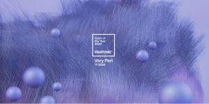
 新泽西州卡尔施塔特(Carlstadt) - 2021年12月9日 - Pantone是全球色彩管理局和专业色彩语言标准和设计社区的数字解决方案的提供商,今天推出了一种新的蓝色阴影,Pantone 17-3938,非常充满活力的Periwinkle Blue Hue,活泼的紫罗兰色红色底色是2022年的年度Pantone颜色。
Blending the faithfulness and constancy of blue with the energy and excitement of red, this happiest and warmest of all the blue hues introduces an empowering mix of newness. Displaying a carefree confidence and a daring curiosity that animates our creative spirit, inquisitive and intriguing PANTONE 17-3938 Very Peri helps us to embrace this altered landscape of possibilities, opening us up to a new vision as we rewrite our lives. Rekindling gratitude for some of the qualities that blue represents complemented by a new perspective that resonates today, PANTONE 17-3938 Very Peri places the future ahead in a new light.
我们生活在变革时代。Pantone 17-3938非常是当下的全球时代精神和我们正在经历的过渡的象征。随着我们从一个强烈的孤立时期出现,我们的概念和标准正在发生变化,我们的身体和数字生活已经以新的方式合并。数字设计有助于我们扩展现实的局限性,为我们可以探索和创造新的颜色可能性的动态虚拟世界打开了大门。随着游戏的趋势,数字太空pantone®17-3938在数字太空中的元评估和不断上升的艺术社区的不断增长,非常说明了现代生活的融合以及数字世界中的色彩趋势如何在物理世界中以及VICE RESSA表现出来。
“当我们进入一个前所未有的变化世界时,Pantone的选择17-3938非常有助于可信赖和心爱的蓝色家族的新颖观点和愿景,” Pantone Color Institute执行董事Leatrice Eiseman说。“涵盖了蓝调的品质,同时拥有紫红色的底色,Pantone 17-3938非常表现出一种精致,欢乐的态度和动态的态度,鼓励了勇敢的创造力和富有想象力的表达。”
“The Pantone Color of the Year reflects what is taking place in our global culture, expressing what people are looking for that color can hope to answer. The Pantone Color of the Year reflects what is taking place in our global culture, expressing what people are looking for that color can hope to,” added Laurie Pressman, vice president of the Pantone Color Institute. “Creating a new color for the first time in the history of our Pantone Color of the Year educational color program reflects the global innovation and transformation taking place. As society continues to recognize color as a critical form of communication and as a way to express and affect ideas and emotions and engage and connect, the complexity of this new red-violet-infused blue hue highlights the expansive possibilities that lie before us.”
Pantone®17-3938在服装和时尚配饰中非常非常轻松
PANTONE 17-3938 Very Peri, a warm and friendly blue hue with a carefree confidence and joyful attitude, emboldens uninhibited expression and experimentation. Displaying a dynamic presence, Very Peri is an enthusiastic blue hue whose whimsicality lends itself to unpredictable color harmonies and spontaneous color statements. Futuristic in feeling, PANTONE 17-3938 Very Peri takes on distinct appearances through application to different materials, finishes and textures, from shimmery metallics, lustrous sheens and high-tech materials to handcrafted looks and natural fibers.
Pantone®17-3938非常美感和头发
Pantone 17-3938提出了个人的创造力和大胆的想象力,非常适合眼睛,指甲,尤其是头发的新颖陈述,尤其是在各种饰面和应用中,从闪闪发光,华丽到尘土飞扬的哑光。
PANTONE® 17-3938 Very Peri in Home Décor and Interior Design
Pantone 17-3938回忆起新的现代性,非常非常注入家庭室内装饰感,通过异常的颜色组合使空间变得活跃。Pantone 17-3938的一种多功能阴影非常适合一系列不同的材料,纹理和饰面,无论是通过涂漆的墙壁,口音家具还是家居装饰,还是充当的颜色,都可以提供多种色彩一种图案中有趣而引人注目的口音。
Pantone®17-3938非常适合包装和多媒体设计
Fusing together the undertones of the constancy and continuity of blue with the energy and excitement of red, PANTONE 17-3938 Very Peri, conveys a message of credibility as well as creativity. Whether appearing in a fantasy digital realm or in physical materials, PANTONE 17-3938 Very Peri exudes a good-natured warmth that quickly engages the eye, making it an ideal shade for many applications of graphic and multimedia design as well as packaging.
使用Pantone®设计17-3938非常非常小
非常佩里(Peri)与多种色调配对了一系列四个调色板,设计师可以通过Pantone Connect Digital Color Platform融入设计中。Pantone Connect可作为移动应用程序和网络上的网络提供,并且是Adobe®CreativeCloud®的扩展应用程序,可轻松且易于使用Pantone Colors捕获,策展和设计。年度最佳颜色页面具有所有相关的颜色信息,可在各种物理和数字设计媒体中使用非常小的颜色信息。访问pantone.com/connect。
MICROSOFT X PANTONE COLOR OF THE YEAR
突出显示颜色di的力量gital design, Pantone teamed up with Microsoft to bring the PANTONE Color of the Year 2022 to life in across Microsoft products — including custom Teams backgrounds, Windows wallpapers, a new Edge theme, and a PowerPoint template infused with Very Peri. Microsoft understands the critical role color plays in our digital lives, especially given our increased reliance on digital tools for communication amid a hybrid landscape.
Artechouse X年度Pantone颜色
A pioneer in the field of experiential art, ARTECHOUSE creates and produces innovative technology driven exhibitions, expanding the possibilities of art and how we experience it. Inspired by the transformational nature and inventiveness of PANTONE 17-3938 Very Peri, Pantone partnered with ARTECHOUSE and their creative team to produce a visually and audibly compelling immersive digital experience incorporating rich textures and images of the Color to celebrate the unveiling in an innovative way for the 21st century audience. ARTECHOUSE New York space, located in a 100-year-old boiler room beneath the Chelsea Market, will serve as the backdrop of our official Color of the Year 2022 announcement to media and influencers across design and creative industries. ARTECHOUSE will further immerse people in the colors by opening an exhibition of the color to the public in 2022.
Tezos X年度Pantone颜色
在节能区块链网络Tezos的帮助下,Pantone将开始探索2022年数字艺术世界的色彩世界中的色彩世界。受Pantone 17-3938的启发的艺术品非常适合创建颜色的数字表示以及颜色体现的信息 - 创造力,创造力和有关颜色的新思维方式。
Very Peri, the color selected as our Pantone Color of the Year 2022 will be added into the Pantone Fashion, Home + Interiors Color System, the most widely used and recognized color standards system for fashion, textile, home, and interior design.
Posted December 14, 2021
资料来源:Pantone


